I am participating in the 2012 Wordcount Blogathon, which means one post every day for the month of May.
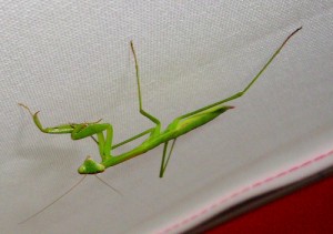
When I first started this blog, I had no idea what I was doing. I had a vague notion that I wanted to write, but I didn’t know how to put a blog together. I had a bit of a dilemma: I wanted my blog to be visually appealing and inviting, but I have the design skills of a praying mantis – a dead praying mantis.
Fortunately, I had some templates to choose from. I experimented with a few of them, and settled on one that looked nice but was impossible to read. Small white text on a black background – what was I thinking?
People started emailing me telling me that I was ruining their eyes. I don’t want to be responsible for anyone’s failed eyesight, so I knew a change was necessary. I went back to the templates and picked out a new one. Black text, light background, bigger font – all-round easier to read. The new design looked a lot nicer too. It looked calmer somehow, less austere and cold.
When I launched the new design, everyone loved it. People thanked me for saving them from a trip to the optometrist. I myself was immensely proud of the new improved Running For Autism.
After about a year, though, something started to happen…
I started to realize that I was actually taking this blogging thing very seriously. I liked to write, and I wanted to write. And I wanted a more professional, unique site on which to showcase my offerings.
Again, I have the design skills of a dead praying mantis. This might be a problem.
Just then, a fellow blogger launched her new site and I loved it. It looked clean and sleek, professional yet fun. I got in touch with the blogger and asked her who had designed her site.
That is how I got in touch with Courtney.
A few short months later, I have a new website that is so beautiful I could cry.
Courtney has been fantastic to work with. She has been fast and professional, receptive to my ideas and forthcoming with her own suggestions. When I had technical trouble with my domain name, she patiently put up with my frantic email harassment and helped me get sorted out. She has always been there to answer questions and calm my fraying nerves.
And look at the website she made me. I mean, look at it! I wouldn’t have been able to come up with this in a million years.
Now I begin the task of bullying harassing nagging sweetly asking my subscribers to move their subscriptions from my old site to my new one.
I am excited to launch this website, which heralds a new phase in my writing. I hope you will all stay with me for the ride!
(Photo credit: http://www.flickr.com/photos/cecphotography/4747271873. This picture has a creative commons attribution license.)


Congrats on your new design! I wrote about exactly that today because coming up with a design that was “me” was exactly my blogging journey as well.
Thank you so much! And congratulations on being the first non-spam commenter on my new site!
Hooray! I actually just read your blog today, so I don’t know what it looked like before. But it looks completely awesome now! Congrats! I think my favorite is the little follow links that match your theme.
Thank you! This site is a much better reflection of me and my purpose than my previous one was. I’m glad you found me and I hope to see you back!
Looks great! And my son (who is graduating high school Friday) is autistic, so I’ll be subscribing. 🙂
I love hearing about kids with autism reaching milestones like that. Congratulations to your son – you must be a super-proud parent! Thanks for the comment, and welcome to my world!
Yep, that’s why I threw that tidbit in there. So proud!